
Wednesday, October 28, 2015
Composition/Grid

Using the rule of thirds, I placed the words to separate themselves from each other and the put the focus on the man running. He is placed on the right third of the image and I have the text split between the left third and top and bottom third. I've also copied the color of the shoes to the text to make the shoes stand out more.
Grid

This picture uses the rule of thirds to focus the attention to where the children are looking. The cement side walk in the background also naturally creates a grid. The color and font of the capture match the same blue of the pool in the foreground. The text is also framed in the light colored sidewalk nearly perfectly.
Grid

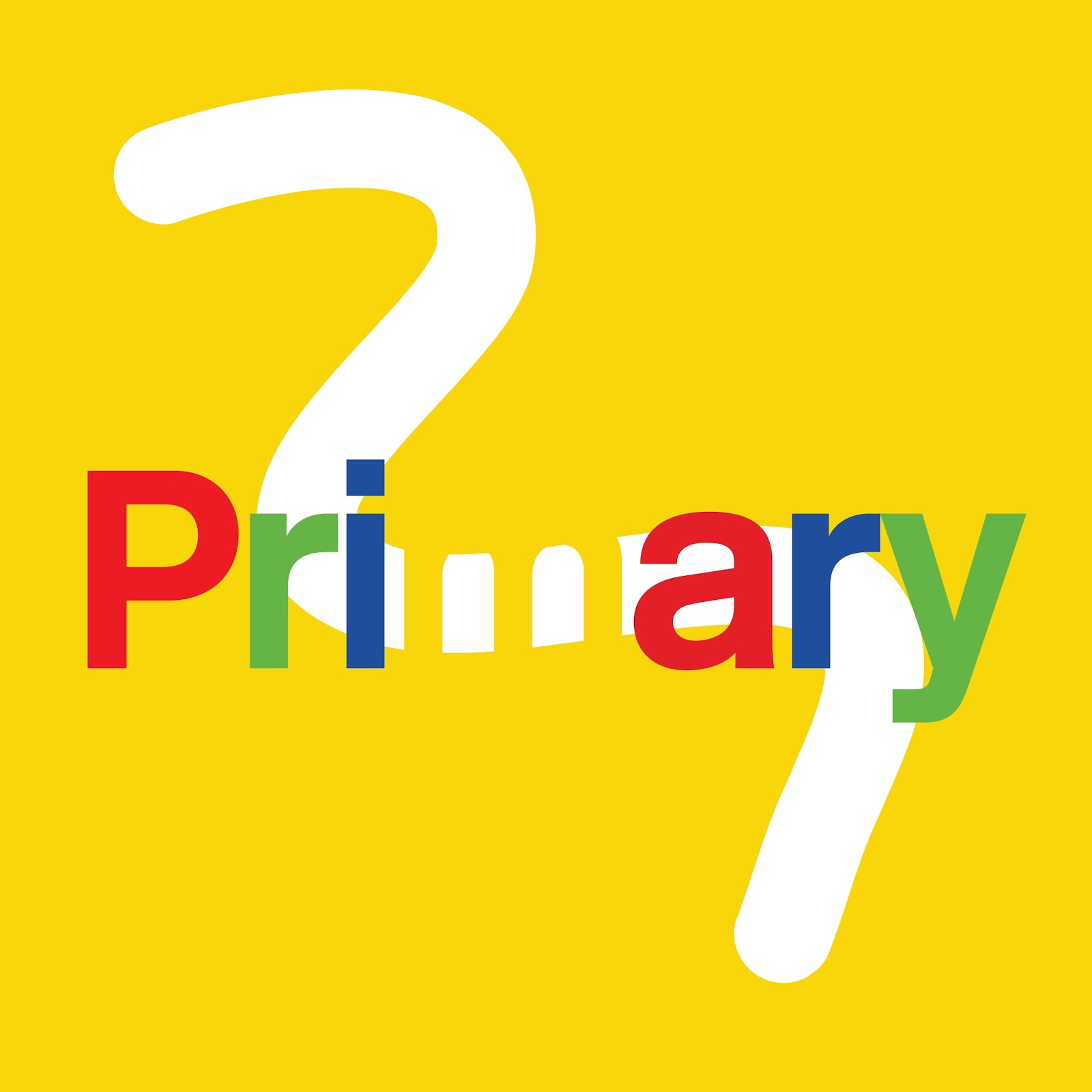
Tuesday, October 27, 2015
Gestalt and Color

Monday, October 26, 2015
Gestalt & Color Theory

Gestalt Theory and Color

I thought about the color and gestalt theory when choosing the NBC logo of the peacock. This logo uses color to catch the eye and repetition to complete the logo. There is also a blank space that becomes the body of the bird. NBC's choices in color and logo are also accentuated by the lack of closure in the bird, it allows the eye to finish the image. I particularly love this logo in the way it draws the eye.
Gestalt/Color

I used closure to create the word "Suns". Nothing more than well-placed dots made that word appear, the outline of the word barely even exists on the purple outline. Since all the dots share similar characteristics in shape and size, the eye naturally groups them together.
Jeep Ad

I think this same idea can be altered with color to be presented in other rough terrains where jeep drivers might find themselves.
Gestalt - Color

Color: I chose an analogous color scheme because I liked how they fit together in a pattern. Since they are so close together on the color wheel, they complement each other well and allow you to have more fun in the placement rather than the coloring.
Gestalt Theory: The two principles I applied were proximity, and similarity. I used similarity in the sense that all of the squares contain the same elements, so you group them together as 9 unit squares in a constant pattern. However, I used proximity with the placements of the geometric shapes within each square to offset the typical pattern and group each square as an individual whole as well. Although the red squares were placed equally from each other, the tan light peach squares inside are all placed according to the grid they are placed within the system. The same goes for the dots as well.
Love Gives Life Color

Gestalt/Color Mash-Up

The whole of this image is greater than the sum of its parts. Each of the parts of this image are comprised of letters and shapes, but holistically this image shows a roller coaster scene made up of the letters of my name. Similarly, my initials "SP" are combined into one symbol, making the sum of the two letters more meaningful and eye-catching. The principles of gestalt theory this image espouses are those of continuation and proximity. Continuation because the eye flow moves from left to right and down, allowing the elements (letters) to combine in a continuous fashion such as a rollercoaster. And proximity because the elements are close together. If the letters and shapes were not as close together as they are, this image might not be viewed as one unit, or as a rollercoaster scene in this instance.
The relationship of the colors used in this image follow that of a monochromatic scale. In other words, there is one main color, purple, and variations of it are used to emphasize different elements in this image. The colors are also harmonious in the sense that they are similar to one another, the only difference being their tints, shades, and tones. These colors give the image a peaceful feel and maybe a little bit of a personality.
By incorporating elements of Gestalt Theory and Color Theory into my image, I have been able to say more with my image than what I could have just by typing my name out. The rollercoaster element and the colors have allowed my name to take on a personality, maybe a personality of silliness and adventure, or maybe something else. It can be interpreted differently for different viewers. The point is, by using these two theories, I have created an image that communicates something more than just my name.
Do you want to go to the seaside?

One of my favorite vacation spots is the Outer Banks and I decided to do a simple ad poster for this hotspot in North Carolina. I wanted the color of my font to represent the colors of the beach so I took cool colors and added a hue to them so that the blue and the green gave the viewer the feel that the cream color of the sand blended with the ocean water (blue) and the vegetation (green).
I wanted to incorporate harmonious colors into the font and have them fade from blue to green because I wanted the viewer to see the contrast in colors. I was afraid that if I choose to blend the colors from green to blue, the blue wording would be lost in the blue color of the sea. I wanted the words to keep their meaning, and the contrast allows the viewer to separate the colors and give meaning to the words.
I gave the wording depth because I wanted the viewer to travel down the picture of the beach. There is something peaceful about taking a stroll down the beach. There is so much to experience. I didn't want the sand dominate the image so I figured that if I gave my colors and the words this notion of continuation, the eyes would be lead on a journey through the picture and through different colorful elements.
STAR WARS

There is a fascination sweeping the nation...Star Wars. Star Wars Episode VII is breaking all sorts of records for pre-sales and the trailer release online broke multiple records as well. I built my example based off America's obsession with these films. At first glance you see the American flag, but upon looking closer you see that the stars have been replaced by stormtrooper helmets with one Darth Vader helmet in the middle. The flag itself displays continuation with eyes starting at the stars (troopers) and then moving to the right along the stripes. I also stuck with the original color scheme of the flag to continue with the similarity. The colors are also primary colors.
Gestalt and Color

I chose to focus on the ideas of closure, and similarity. Because the image of the hiker is not actually there, our minds fill in the blank space with an image of a hiker. The similar shapes of my stripes visually belong together even though they are not the same color.

My color palette came from a photograph that I took. I used adobe kuler to help recreate the colors of nature found in my photograph.
Gestalt/Color

I chose to use shades of the same color to make my design. I wanted the different color to stand out the most but in the image but didn't want the phrase at the end to be distracting by being another bright color. I chose to stay with the color that the image that is different is to "stand out of the crowd" as well but chose a darker shade so that the lime green image was what your eye is immediately drawn to but the phrase is still different from the rest of the image as well.
I used the continuity and similarity principles to create the design. I feel like any other principle wouldn't have the same effect because similarity and continuity are both boring, stereotypical designs which is what the message is conveying. Everyone tries to be the same as everyone else but we need to be our own person. All the images are the same besides the one that is trying to stand out.
Color/Gestalt

Since I love Halloween and its this weekend I decided to honor it with an unique skull that I made using Adobe. My gestalt principle that I used was similarity. As you look at the skull you see the unique orange that was created (f27300) and it draws your attention closely. At the jaw of the skull you see the black that says "scare on" this stands out not only with the words but with the image of the skull. It attracts the viewers attentions with the color and the image making it unique. I love the different fonts that were applied to give it a eye opening look.
Color/Gestalt
CREDIBILITY RUINED.
I created this simple font and color to symbolize the faux pas that is choosing Comic Sans as a font to represent an official business. The color gives off the image of "trying to hard" as well as the font. Businesses, especially local ones, think that using this font gives them credibility but instead it makes it seem like they don't know how to function properly in the corporate world.
It's amazing how much a font and how it's typed can make a business lose complete credibility. I applied the closeness of the letters as yet another statement on how inappropriate this font is for a business setting.
PIZZA

I chose a black, white and gray color scheme because lately black and white images I've seen on the internet have really been sticking out to me. Also I think that black and white normally gives off a more serious tone to it, which I thought would be interesting to add to something normally not perceived as serious, such as pizza.
It was actually surprisingly difficult for me to figure out how to create black on the adobe color wheel but I eventually figured it out. Using the shades color rule I was able to find a nice black and create a gray scale color theme.

And then for the Gestalt aspect of the assignment I really liked the idea of closure and was going to try and get the pizza slices to form the Z's in PIZZA, but it was surprisingly a lot more difficult than I thought. Trying that out really helped me appreciate closure gestalt images.
So instead I chose similarity and proximity as my gestalt features. With the pizza slice background being all similar slices of pizza causing our minds to group them together. And then the foreground pizza is overlapping and close together which makes my mind not really distinguish them as separate pizza slices, but instead it kind of groups them together as a pizza foreground object that serves as a nice backdrop to the black font "pizza".
color/gestalt
 For the color scheme I decided to use the triadic color scheme for the eyebrows, eyes and beard so that they would blend together. I really wanted the beard to stand out the most so I left it the brightest color out of the three colors. I wanted the tie below the beard to blend with the beard so I used the complimentary color to it. I used the principle of closure and left a lot of key parts of the face out of the picture to let the viewer put together the rest of the picture. I used the principle of proximity and did not let the parts of the picture touch but left them close enough to be perceived as one unit.
Color/Gestalt

My color scheme was analogous. The light orange color (used for the rays and the word "shine") was the central color. I used the principle of similarity with the rays and the colors of the rays and the word "shine." With the similarity, I tried to create continuation--"shine" is continuing outward like the rays. I also tried to use proximity with my placement of the words in and out of the circle of the sun.
Gestalt and Color Assignment

In this image I created a color pallet in Adobe and used to of the shades of white and black. Using the gestalt theory of closure, the mind makes the image of a skeleton head even though the only thing I did to create the image was erased some black and added eyes and a nose. Having a color that contrasts with black makes the image pop and gives an imaginary line to the skeleton head.
Color/Gestalt


The Gestalt principles I've employed here are proximity and closure. The proximity of the individual lines draws imaginary lines to where the lines should be connected, and thus perceived as one unit. We also fill the gaps in where there is space to complete the full letter--closure.
The color scheme I've chosen is a compound scheme, meaning it is a combination of both a harmonious and complementary color scheme. The light blue and the red-orange lie across from each other on the color-wheel while the shades of blue lie next to the light blue. The peach color lies next to the red-orange, complementing the darker blues.
Gestalt & Color | Batman

I decided to use two Gestalt principles: closure and proximity. The "fall" in the design is obviously meant to have the feeling of falling down, but also since it is broken up into different objects it follows the proximity principle from Gestalt. The reader will interpret this as one unit rather than several different units because of the proximity.
The closure principle is my favorite from Gestalt. This design is very popular and as I was experimenting with my design I felt that it accented the message that I wanted to communicate. I tried not using closure and it seemed boring. When I applied the closure principle it accented the words that I wanted to be the focal points.
Although I'm a novice at design, I feel like the falling of the word "fall" causes the reader to continue to read the design rather than having it just be another boring question. This Gestalt principle teaches that readers are drawn to objects that are broken up but are in close proximity.

I used kuler.adobe.com to find the right shade of red to apply to the font that I wanted to be in color. I tried using complementary colors or adjacent colors, but it communicated a different kind of message. I wanted the message to be serious and simple rather than have elaborate colors. I used the color scheme for the "fall?" and also for "learn" and "back up." This helped accent the right words and draw attention to the major points of the short message.
I decided to use a dark shade of red. I like colors that have a lot of hue added to them because I'm not a fan of bright colors on a simple design. I changed the color options in Adobe InDesign to RGB and adjusted the color swatches to match the RGB in the color scheme I chose on kuler.adobe.com
In class Professor Cutri showed a few examples of this assignment. The "Fail, Fail, Fail, Succeed" design captured my attention. It was just a white background with black font and used the closure technique. I decided that I didn't want to do any harmonious coloring because I wanted the design to be the focus rather than the color scheme.
Gestalt & Color

For my design, I chose to use the gestalt principles of continuity and proximity. The stars start in the upper left hand corner--where we naturally start to read--and then guide the eye down and to the right where the message is. Also, the stars begin larger and further apart, becoming smaller and closer together around the text. There is also closure in the design, as the stars around the words create one big star. I used Adobe's Kuler website to choose two colors which are complementary to each other--the yellow and the blue--and then set them on a dark background to make them stand out.
Time...

Keep moving forward

Elephant Lives Do Matter

I wanted to create something that sent a message regarding elephant poaching in Africa. In this image, the proximity of the letters connect them together as a whole. There is also a figure/ground optical illusion of which the letters themselves "eLDM" create the body of an elephant. Lastly, closure was used in a way that helps the eye to more easily see the image for what it is meant to be. The colors are complimentary and the brown provides an excellent "muddy" backdrop for the elephant which is created with two different complimentary blues to help the image to stand out as an elephant and individual letters.
Sunday, October 25, 2015
Gestalt and Color

I'm a Volkswagen Beetle fanatic! I found three images of the three reincarnations of the bug and arranged them on a white background using the gestalt principles of similarity and continuation. This gives the feeling of the message I wanted to portray; that the bug has evolved through different stages. Using kuhler.adobe.com I used the bright color mood to pick out the different colors for the text from the three vehicles. I wanted the text to reflect both a new and modern feel (in the word "evolution") and also a vintage feel (through the phrase including "classic") while echoing the familiar VW ads with the tagline at the bottom "It's classic for a reason." Together, these elements create a visually interesting image that tells the story of a bug's life!
Gestalt

I used similarity and continuation. Your eyes move from the left to the right and they stop on the heart and the message. Altogether it looks like one image but as you look a little longer you can see the similarity effect. I stayed with the black and white to keep the image monotonous so the brain has to work a little harder to see what the message really is.
Product (RED)

I used continuation and similarity to reproduce the word RED at the top. It causes the eye to move down to view the red rose, which then points to the logo in the bottom left corner. The whole design feels more fluid using continuation, and the similarity just brings the color scheme together.
The Real Gateway Drug

The uses of Gestalt theory are very subtle, but I feel like they still work. There is use of proximity as you put the head and the neck together, as well as in the differentiation between the paper, cigarette and face. The elements of proximity create a really simple but interesting feeling, giving the picture a really clean feeling overall.
Alongside the use of continuation in the letters on the bottom of the strip, there is also a really subtle use of figure/ground that you might notice after looking for a minute right where the man's lips are - you might notice a keyhole being unlocked by the cigarette. Once you catch that, it opens up a whole new meaning to the picture.
The inspiration for this piece comes from an insight gained by a friend. I wanted to take an opportunity to raise awareness of the "real gateway drug."
Gestalt/color

Gestalt/Colour
My Gestalt principle is closure. I used a primary colour scheme and matched the background to the letter to force the viewer's mind to read an "m".
Gestalt/Color: Ballerina

The first Gestalt principle I used was closure. Here you can see a ballerina's shoes and her tutu. Although her feet and legs are missing, the eye still fills in the empty space. The second principle I used was continuation. Although the legs are not there, the legs that your eye fills in draw your eye upward. I decided to put the word dance going upward to compliment and further draw the eye upwards. As for my color scheme, I used a very monochromatic color scheme. The colors are black and then different hues of brown. Although the shoes seem to be a little on the pink side, they fit into the monochromatic tans.
Wander*

Don't be a sore loser

For my design, I used a monochromatic color scheme that I created through Adobe Color CC. I wanted the colors to be shades/tones of oranges to go along with the basketball theme. From the Gestalt principles, I tried to use similarity and closure. "Nobody likes a" is in one color and "sore loser" is another to show which items are similar. I chose the darker shade so that "sore loser" stood out a little. I used closure in the "o" of "loser." Although there are no borders on the "o" and no distinct image, the shape is designed in such a way where most people can determine closure on their own and understand that it's a basketball.
Saturday, October 24, 2015
Gestalt/Color

I used Gestalt's closure and proximity principles. The eye finishes the empty space between the elements to form a can of paint and the close arrangement of the elements establishes that this is one object. For my color scheme I chose a harmonious relationship because I liked the way it flowed easily from one color to the next, like paint would. The colors also help show how the elements are connected to each other.
DON'T QUIT

I used a complementary color scheme to help the "Just Do It" stand out and contrast well with the "Don't Quit." I also employed the gestalt principles of closure, with "just" and the Swoosh, as well as similarity in the repetition of "Don't Quit."
Color Theory and Gestalt Principles

For my design I chose first to us a complementary color scheme because I knew I wanted to have a neutral logo with an accent. I first chose a rather neutral light brown hue and using kuler then found it's complement, a light blue color that really stands out while also giving off a calm and reassuring tone. Next, I focused on gestalt principles. I first and foremost used closure in this design by eliminating parts of the letters S, F, and E, but leaving still enough for the brain to mentally complete the letters. The lock itself is also not connected at the top, but again the brain is still able to piece the two separate parts as one whole "lock" in this case. I did this design because I wanted to give off the subtle idea of things being unsafe by being left open or slightly incomplete like the letters are. The other principle I used was continuity and similarity. Even thought the lock is suddenly a large, initially different looking shape among the word, I added continuity by adding the bar at the the top to help lead the eye gradually from the S to the F and by adding a softer "a." Also, because there is a letter clearly in blue box, this gives the shape similarity to the other letters and thus, the brain still sees the image as one part of the word. These principles were chosen as a way to add interest and an image within the image, without disrupting the flow of the logo or creating confusion.
Call to Action

This is a call to action, and I changed the "'v" in vote to a checkmark that invokes the idea of checking a box for an issue or candidate.
The colors also are intentional and patriotic.
I used color.adobe.com to find the red and blue that were classically "American".
Emotional Heart

For my project I took a hue of red and slowly shifted the tones by 10% with each diagonal row of hearts by using the hexadecimal system. The gradual color shift is appealing to the eye because they seem to flow and mix together. It is not till the end of the color scheme, near the greens and light blues, when your eye truly understands how many colors exist between each 10% interval jump, because the colors seem to be shifting too quickly. I used the Gestalt idea of similarity to draw more attention to the color shift then to the shapes itself. Due to proximity your brain perceives the image as one and therefore attempts to disregard entirely the random black heart that is the wrong shape and color. The color and structure of the piece also allows for continuation as your eye passes over the square. That continuation is broken by the black heart, but if you stare more closely you will find that the "square" is actually a rectangle, though your eye prefers to think of it as a square, because that would be more appealing and symmetrical.
Thursday, October 22, 2015
ApplicantPro

I work with the marketing department at ApplicantPro. This is a company logo I designed for them that combines the Gestalt principles of closure and proximity. The strikeouts emphasize a closure forming the word "Applicant" and the proximity element allows you to see the word PRO, when really the elements are just perceived to form the word. The background and fore ground are also put at contrast to show what we do with the words in the background. The color rule is monochromatic, using different shades and transparencies from the 8EACBF blue to FFFFFF white.
Wednesday, October 21, 2015
Typography | Journey

This picture gives a sense of hope and adventure--two of my favorite feelings. I've always identified with this quote because life experiences have made me take small steps without knowing the end. I'm still on my journey and every day I choose to take a step forward.
I enjoy the composition of the photo because the focal point is what is in the distance and the direction of the path. Also, as I have contemplated the future I've found it helpful to choose to focus on the single steps rather than the ultimate destination.
I chose this font because it's playful yet honest. Instead of choosing a fancy font style, I feel that this quote is best portrayed through a calm declaration rather than bold.
The entire composition speaks to me because it calms me and gives me hope for the next step. And coupled with that hope is a determination that every single step will be better and towards the bright blue sky.
Wednesday, October 14, 2015
Typography

Sorry this is a little late!
I'm a lifelong fan of the New England Patriots. Like many, I was disappointed to hear of the "Deflate-gate" scandal, but was deeply relieved when a months-long investigation produced no hard evidence of wrongdoing. The Super Bowl victory was especially vindictive.
I believe the scandal was largely a construct of the NFL and popular media, who have historically tried to "deflate" the Patriots' accomplishments with accusations of cheating. My picture shows that unfounded accusations can't deflate a championship trophy. I chose a cursive font for the word 'Deflate' to convey the frivolity of the accusations, and a capital bold font to articulate the achievement of a fourth Lombardi trophy.
Go Pats!
Monday, October 12, 2015


Subscribe to:
Posts (Atom)