Thursday, March 31, 2016
Wednesday, March 30, 2016


Typography, Call to Action

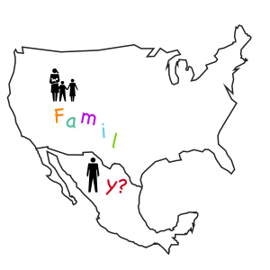
I want people to realize that some of the immigration policies that we have, are weakening the family. Some people get deported after being in the U.S. for decades. When you have been in a place for long, you have a stablished life, especially if you have a family.
By separating the word family by the geographical border line, you can tell that something is missing. That something is wrong. This may lead to people looking up policies or looking up what their candidate stands for.
Which Way?

I held the camera to the ground and then just waited for someone to walk by. I wanted to depict confusion and lack of direction with the many different texts and voices speaking in this image.
Typography

I used Baskerville italic because it felt more active, and I used Herculanum Regular because it looked like Bamboo, which in my experience is pretty calming. Another good choice would have been something like Desmedona for it’s clear insides and outlined nature, but at the end of the day bamboo was more calming to me personally, and that is what I feel this is about
Typography - Jordyn Crowley

Type

Often we as humans can feel like we are drowning in midst the many task and responsibilities of our lives. My thought was to make something to remind myself you are doing okay. The picture helped to give context to the copy I used. Having two people in the pool doing the same thing shows symbolically we are not the only ones going through trials of life. I mimicked that with flipping the word float to be two sided.. showing that though we may be different sizes (or places in our lives) we can all "stay afloat. I decided to spelt up the word A- FLOAT to emphasis the idea of floating. So by reading it you understand the message, but at first glance you see only the floating.
Merri Call to Action

I used similarity, proximity and contrast in this call to listen. I wanted "Talk" to be so repetitive and boring that it actually faded into the background of listen when you look closer.
Typography- Tanner Young

This is supposed to be a poster, it's just hard to see with a white background. I made this thinking about a charity organization I want to work for this summer. They have a simplicity style, so I kept that theme. What I did to catch attention is varying the font size, weight and capitalization of the text. I wanted the word "BE" to catch their attention to hopefully make them feel a sense of responsibility.
Call to action

Typography

I wanted the message to be very simple, straightforward and not fancy or high-tech. The simlicity of the text is symbolic of the simplicity of following the prophet. I messed with the kerning so that it looks like the letters are being pulled toward the prophet and with the underscores below. The word "prophet," however, I kept normal with a solid line to show how sturdy and reliable the prophet is. I included more space between the letters and the underscore to draw attention to his eyes and smile.
Typography - Call to Action: Makena Bauss

If there is one thing college students don't do enough, it's sleep. So as I approached this assignment, I wanted to encourage better sleep habits. The warped text, fit into the shape of a sleeping person, reminded me of dreams and their sometimes distorted nature. This is accented by the hand-drawn nature of the font which feels decidedly less formal. The bold font additionally gives the message weight and punch, reminding us to let ourselves be "knocked out."
Typography call to action: Kalli White

The call to action I chose was, "Take off the mask." I wrote a little something deeper about the meaning of the statement and incorporated it into the greater, overarching message. I removed pieces of the letters and had some text use negative space to make it seem hidden and difficult to read, just like it's difficult to "read" somebody living behind a mask. I also used a traditional Times font to show how it's a mask we live in every day.
Typography Call to Action: Nicole Utley

The last three letters are replaced with the ampersand so that it still reads correctly, but it makes more of a statement. The premise behind this is that there is always more to the story. If we ask ourselves "and?" before assuming things, we are seeking to understand before judging.
----------------------------------------------------------------------------------------

The stop sign/period is halting the letters, which are made to look like they all ran into each other. It's a visual representation through typography of the power we have to put a stop to human trafficking.
Tuesday, March 29, 2016
Call to Action

For my call to action I used size, legibility, baseline shift, and weight to set a tone and emphasize the message. I've been feeling overwhelmed by 'everything' lately and wanting to make decisions, but I have to force myself to wait instead of rushing into things, and that has taken a lot of patience. The text, font size, and text overlay convey the emotions I have been feeling.
Typography Assignment - Chris Osmond

Typography: Call to Action

I wanted to create a call to action that not only communicated its message through words, but also through an image. I chose to capture the phrase "don't sweat the small stuff" in the shape of a drop of sweat. I created it in Illustrator. I chose blue to represent water and capitalized the words "sweat" and "small" to emphasize them.
Typography, Call to Action - Will Hayden
I think it's good to use some of our time to think and reflect. I decided to represent this idea of mindfulness by separating the word "time" from a massive body of available time. The words "take" and "to be still" are highlighted by their darker color. This gives the viewer's eye definite focal points and provides a sort of start and end to the call to action.

TYPOGRAPHY-call to action HAILEY WEENIG

I like cake and i want people to eat it, I used a simple typeface and kept it as black so that the focus is on the a in eat and cake, which I changed to essentially look like a piece of cake. I wanted to keep it simple and linear, so it was a clear call to action and got the point across right away.
Typography- Call to Action: Camden Buchanan

Skinny America
I wanted my call to action to be about fighting obesity. I was playing off the idea that most fast foods offer "Freshness." Yet in reality we know we are getting the opposite when we spout off our order into the drive-thru microphone. I thought the idea was powerful because of the irony. The use of the french fries and the left over grease to spell out the something they are not.

Typography Call to Action - Alex Scoffield

This call to action is to all those sugar cookie with sprinkles Swig lovin' ladies out there. Felt like challenging myself to creating something completely unrelated to my own styles and interests so I hunted the font, added the colors, and made the cookie. The font itself is playful and fun (even appetizing) like a sugar cookie. It's also extremely female heavy with the color scheme, and common colors of sugar cookie frosting and sprinkles. The cookie replaces the word "bite" but still directs the viewer's mind to the word bite. The phrase "take a bite" is ultra common and we all recognize when a bite has been taken out of a cookie.....
Typography Call to Action- Karenna Meredith

I wanted my call to action piece to be specifically about the refugee crisis, especially surrounding the recent topics in Women's Conference. I chose the scripture that was referenced, in Matthew 25:35, with a picture I found of a refugee child. I feel like the black and white simplicity of the photo really lends itself to the text, and the message is able to be communicated clearly because of the simplicity of everything else.
typography creation

The message here is very simple. I didn't want to do anything to it to overcomplicate it. I felt like I could best represent the message by using simple fonts and keeping the image clear. I chose a background that fit the message in order to create an image in the viewer's mind. I added a word square in order to keep the focus on the text, not the background. The top font is Champagne & Limousines, and the bottom font is Stockyard. Both fonts are Sans Serif and are simple in design. I wanted to keep everything simple in order to keep the focus directly on the message I am trying to get across. "Just Keep Going" is the biggest part of the image, and that is because I feel like it is the main part of the message.
Typography Call to Action- Hannah Drees
What I did was create this call to action through InDesign. I am quite an amateur but I did what I wanted to do with it. My phrase that I chose was "Be Different" and I wanted to find a way for the actually phrase or part of the phrase to be different. I like how it kind of tells a story. The first parts of the phrase are all in uniform, all the same, while the "t" is taking the advice of being different and do his own thing. Its crooked and a different color. I wanted to illustrate that the difference did not need to be big but that a little "out of uniform" is good.

Typography, Call to Action - Brigham Kmetzsch
Maybe it's because I've been staying up late and not getting enough sleep, so I tried something with this saying. It's one of those "haha" sayings that people sometimes say, but I think it really has a great message about working hard and being successful. If you are willing to give up sleep for something I think that means you are passionate about it and really want something. I tried to make the word "sleep" look kind of like a bed with the "ee" as kind of a zzz coming up from it, but it may or may not have worked. I also flipped the word "die" on the side, to kind of symbolize a skeleton or coffin. I also tried to use some word spacing and the colors to see the above ground and bellow ground.

Typography - Alex D

Typography Post

Typography- call to action

Typography - Call to Action

I was thinking a lot today about my home and my parents and the house that I grew up in - how I truly believe that home is where the heart is. I then thought about how close my parents live to me and how I really take that for granted. Anyone who can go home often, should; including myself. I manipulated the world 'heart', repeating it over and over and into the shape of a house. This really conveys the idea that the home is made up of the heart. I made the 'visit' larger so as to emphasized the call to action. The combination of the everything says "visit home, it's where the heart it" without having to state it explicitly.
Typography Call to Action: Samantha Clark

Above is a screenshot of a "call to action" that I created in Illustrator. The message that I was trying to convey was in the phrase "study break." I have a lot of big projects and tests coming up, so all my mind is focused on is studying and I feel like I hardly ever have time to take a break. I put the word study in a large point size in all caps, and bold--I really wanted this to stand out compared to break; I also choose a font that has a scholarly feel. I used a cursive font for and changed the tracking to get a more whimsical feel for the word break; I also used a light grey font to make the contrast between the two words noticeably different. I also included a line "break" between the two words. I choose to communicate this because I feel like studying consumes my mind so much more than the fun (whimsical) times I have when I am taking a break from assignments.
Kayla Ellis | Call to Action
 |
| I used the contrast of snow and blossoms to symbolize the changing from "winter" to "spring" in our own lives. The "Wait Upon The Lord" is warmer than the background, giving it a sense of hope. I also used the font Helvetica because it was the most powerful and kind, how I would imagine Isaiah actually said it. |
Typography- Call to Action

As I sat there and brainstormed what kind of "call to action" I have for the world, I thought about knowledge. I thought about the implications of open minds and contrastingly the implications of small minds. I think that if everyone put as much effort towards learning as they do everything else the world would be a better place. Where better to find knowledge and expand your mind than in books. So I used an old page from a book to make clipping masks for the letters.
Typography Shannon Havlicak

Typography call to action - Chase Lewis

At the clothing brand where I work, we've been toying with the idea of sponsoring a basketball tournament "VAVLT HOOPS" to generate more awareness and buzz about the new retail store in Provo. The VAVLT logo itself is very graphic, and I like the idea of using the recognizable logo as the pole for the basketball hoop. I also tried to use a Nike-esque font for the Hoops lettering, to create an additional association with basketball.

typography-call to action-sebastian meyer

I am a fisherman. When I'm fishing, I feel a sense of oneness and personal interaction with nature in a variety of ways. I love teaching people to fish as well. One of the best reactions in the world is when somebody has their very first catch on the line. It is a combination of excitment of actually catching a fish, and dread that they have to touch a slimy, scaly animal. I wanted to inspire people to fish by using this word as a verb. The "call to action" is get people out there with their reels and hooks. I tried to be obvious but still understated in my choice to change the letter "I" to a pair of treble hooks back to back.
Typography: Call to Action

Typography Call to Action - Tatiana Hernandez
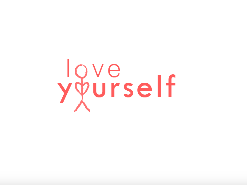
I decided to make this my message or call to action because I think it's an important thing for all of us to remember. I may have been a little inspired by Justin Bieber, but I wanted the message of loving yourself to come across. So I chose to draw this stick figure and make the head the 'o' in "love" and the arms form a heart for the 'o' in "yourself." I made the focus of the poster the self by making this stick figure. That's what brings the two words together. And I also wanted to focus on the self by making the "yourself" word slightly bigger and bolder than "love." Both words are necessary for the message, but I tried to make them compliment each other.
Typography Call To Action

I took this from one of my favorite scriptures Psalms 46:10: "Be still and know that I am God." I made "still" a lighter, softer blue and "know" a darker, bolder blue. The lighter blue represents the stillness and peace we feel and the darker blue represents the depth of our conviction. I decided to put them all on different lines because I felt it made you read each word individually and with more meaning. I made the word "know" biggest and separated the letters from each other in order to provide emphasis. I chose to make it simple overall because the call to action in reality is a simple call: be still and know.
Typography - Call to Action - Marinda Risk

I've always loved cats, and I was thinking of how to incorporate the word "relax" into a cat's form. Cats are pros at relaxing, but one thing they do take seriously is catching prey. I decided to create a cat and mouse silhouette to capture a feeling of calm relaxation punctuated by impending danger - yet the cat is removed from the danger, and knows the mouse will die regardless of whether he takes the bait in the mousetrap or not. The call to action is for the viewer to relax, and calm down, because regardless of the actions taken the outcome will be the same in many situations (although unfortunate for the mouse.)
I chose a rather chaotic font in red for "control" to emphasize impending doom for this particular mouse, in stark contrast to the free-form "relax" which follows the cat's form. "Under" also happens to be underneath the mousetrap, which was a slight visual play I wanted. The direct line of the cat, text, and mouse was designed to create a tension and connection I wanted between the hunter and its prey.

Typography - Call to Action

As can be seen, my call to action is "Make some noise." I decided that I wanted to set this phrase against a grainy background to set the mood. Although a grainy background doesn't actually produce sound itself, we often equate noise with film grain, because of the loud sound that can happen when the television lacks a signal.
I also altered the font, not only making it grow in size as it reads forward, but also making it rise on the horizontal plane. The purpose of this was to show an increase, done as a representation of an increase of sound. This also works nice, because the font makes a cone shape, which may remind the viewer of a megaphone--an object used to amplify sound.
Monday, March 28, 2016
Typography-Call To Action--Hannah Nelson
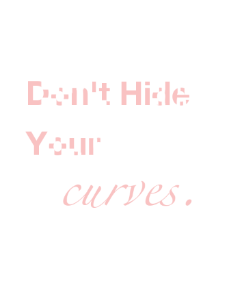
My call to action is to all the curvy women out there. Stop trying to hide your curves, but embrace them. I wanted to display this in the call to action through its typography. I chose a light pink, a more feminine color, with a simple white background, to prove that my audience was directed to women. I wanted it to be a "soft look" as curvy women tend to be more soft ;) I "hid/erased" the curves in the first three words giving it the Gestalt "closure" effect. My motive behind this was to show that although the words are legible, they aren't as beautiful as the last word without their connecting curves. The last word, "curves," I wanted to be fully embracing the curvy letters to show it's beauty in it's truest form.
Typography - Elizabeth Gillespie

I love this picture! Not only does it look delicious, but I love how fresh the image is. I really love to cook, and this seems like a peek in to an inviting kitchen with great ingredients and endless options to cook with. The font is very clean and appealing to my eye.
Typography

I like typography because it can take something and completely manipulate it to be something else based off of the font chosen. If you took the type away from this image, it would just be a gradient background - pink to yellow. Pink normally seems more girly and yellow more sunny, but when you add this font, it completely changes. It suddenly seems sporty and modern and it's no longer bright and girly. I also really like sporty-looking fonts in general, but specifically how this one changes the whole feeling of the image.

Typography - Chase Lewis

I saw this at the Cooper Hewitt design museum in New York, and I really liked the creative presentation that allowed you to see both words as well as portray the idea of light.
Subscribe to:
Posts (Atom)