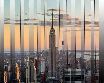
I played around with a few concepts of the Gestalt principle and on photoshop before settling on this one. By using the rectangle and line feature on photoshop I was hoping to make the closure and proximity elements more dramatic. The closure feature was accomplished by creating blocks of different color in contrast to the original image, letting the eye fill out the rest. Even there the image is missing some information the eye can still see that the image is NYC. I then achieved proximity because from the angle the lines can all be grouped together can be perceived as one unit. Overall, i like the Gestalt principle and with work, I can achieve very cool effects.
visually i really like this piece. with your rectangles being so transparent, the "closure" element doesn't feel super strong -it doesn't feel like my eye is filling anything in because I can actually see the whole photo-does that make sense?
ReplyDelete