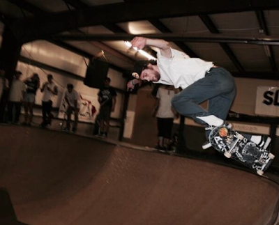
This first photo I took emphasizes the subject vs. background. The skateboarder is in the foreground, and he is wearing a white shirt which makes him lighter and bigger than anything in the background. I used photoshop to blur the background to make sure the focus was on the subject of the photo. I also tried to make the skateboarder lighter so that more attention was drawn to him.

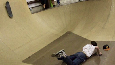
This photo tries to emphasize balance. I thought having the skateboarder on the ground in the bottom corner was balanced by the skateboard and the feet of a few spectators up in the top. They balance each other across a diagonal axis. I used photoshop to crop and tilt the photo. Originally you could see the entire bowl as well as the whole bodies of the spectators. Leaving the spectators' entire bodies left the photo too heavy on top, but cutting them out completely left only the skateboard to balance the skateboarder, and that was not enough. Tilting the angle of the photo also made it so you could better see the movement in the photo. There is more focus on the skateboard and how the skateboarder is looking at it as it's about to fall back down the ramp towards him.

I focused on point of view for this photo. I took it at eye level when the skateboarder came close to the camera. I think this provides a really interesting perspective because it seems like his deck is going to come straight at the camera, which is something that you wouldn't get to see if the photo was taken while I was standing up. I used photoshop to adjust the contrast and exposure. I made the background really dark while I added light to the skateboarder- especially his skateboard- so it would highlight the unique perspective more.
This looks like it was a fun shoot.
ReplyDelete