My call to action didn't turn out exactly how I wanted it to (it looked a lot cooler in my mind). Despite this, I think it still gets the point across. I decided to use a picture I took to make an anti-pornography ad with the slogan "see no evil". When I chose the font, I wanted one that was readable with narrow letters. I ended up using a font called Courier. Here is what I ended up with:
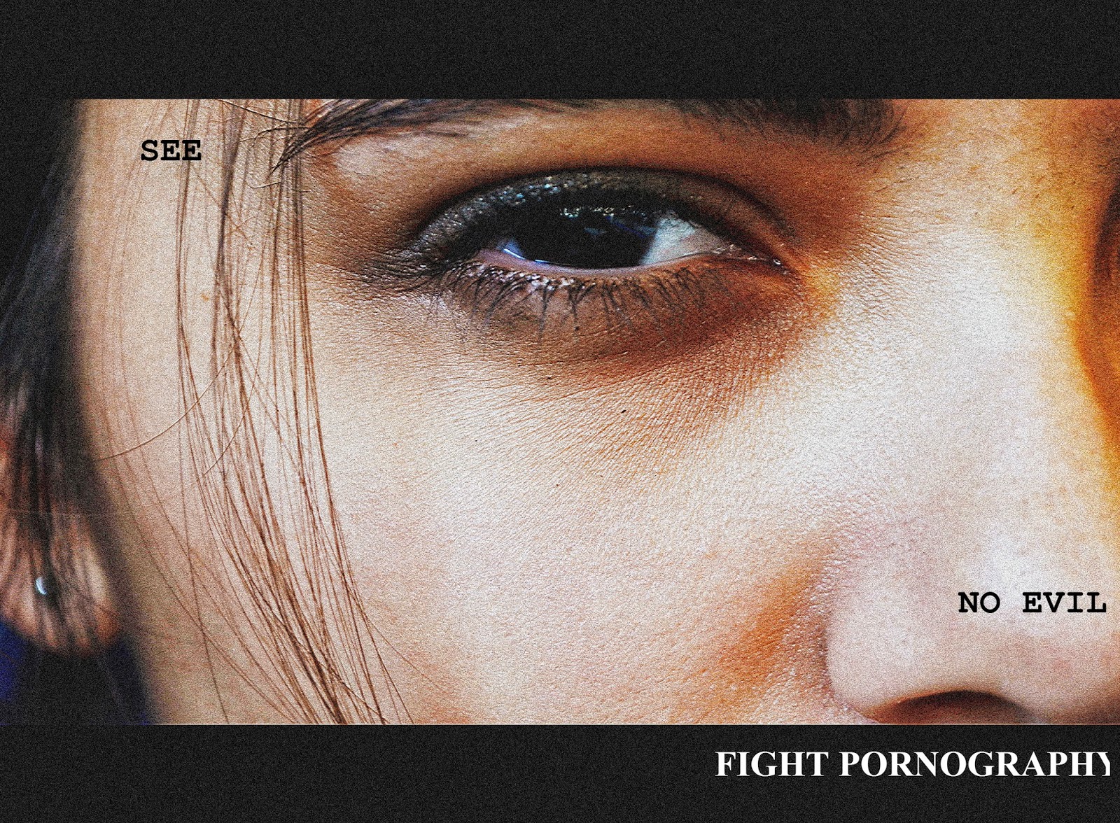
I wish I could have made the words larger, but the software wouldn't let me. Even if I made the font larger, I probably wouldn't have changed the font style because I think it has a strong appearance and is easy to read.
This flows really nicely.
ReplyDelete