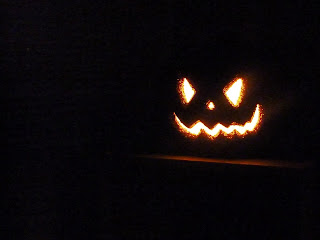
These two photos are essentially the same composition. This one is supposed to represent sort of an asymmetrical composition. But I mostly just tried out the rule of thirds here to try and place the pumpkin to create a kind of asymmetrical balance in the photo.

This is an example of bilateral symmetry. Basically what I did was divide the pumpkins up on this set of stairs and took a shot right in the middle of it creating a sort of even balance. Also, the front 2 pumpkins are more focused while everything else in the background is a little blurred out. This allows the viewer to focus on the first two pumpkins which have interesting designs for faces. I thought them to be the most important parts of the photo which is why I put more focus on them.

You can see on this earring an example of radial symmetry. At the very center the central axis is a small circle and as you go outside of that and look around it the shapes have a symmetrical design to it.
Enjoy these poorly shot photos hahaha
~Eric Smith


No comments:
Post a Comment