I took these pictures while I was in Europe last year. They all illustrate different types of composition.
This first photo illustrates radial symmetry. The circular design on the center of the cathedral is symmetrical around a central axis (the very middle of the design.
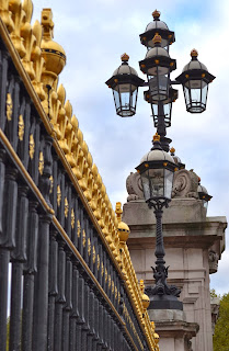
This next photo shows bilateral balance. While it is not symmetrical, it is balanced on both sides of the composition. On the left side of the picture it shows the railing or fence. This is balanced out by the intricate pillar that is shown on the right side of the composition.
This third photo demonstrates both bilateral symmetry as well as the rule of thirds. It is almost perfectly symmetrical (if you exclude the pillar on the left side of the picture) when you cut it down the middle vertically. It also shows the rule of thirds in that 2/3 of the picture is taken up by the eiffel tower and then the bottom 1/3 is taken up by the bush.


No comments:
Post a Comment