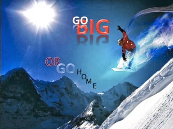
For the caption on this picture, I used color and size to put most emphasis on the word BIG. I grouped the words "go big" and then "or go home" so that it would be simple for readers to read and understand the meaning quickly, and I put the words descending diagonally below each other to match with a snowboarder descending a mountain. The style of the words "go big" have shadows underneath them since they are close to the sunlight in the picture. I also wanted to highlight "home" in a way that makes it seem inferior to BIG. This is why I used basic black type, simple font with less weight, and a baseline shift on every letter to portray home as lesser and lower than BIG.
Cool. I think thats me in that picture... joking. I might play with the "OR" it stands out from the rest of the type. But maybe thats what you want it to do. good work.
ReplyDelete