 I found color inspiration in a photo I took of an industrial scene. This photo features deep burnt orange hues. Near the top of the photo, the orange tints to a lighter color as white blends with it. Towards the bottom, the orange blends into browner shades. Because this photo employs adjacent color relationships, its scheme is considered harmonious. This makes the photo seem more subdued and less dynamic.
When I found this photo's color scheme using Kuler, I decided that it matched the feel of the band Nirvana. I copied the RGB numbers into Illustrator and created a design of Nirvana lyrics accompanied by a picture of Kurt Cobain, using the color scheme from my photo. I love that these colors evoke a muted sense of unease; this feeling matches Nirvana's style. 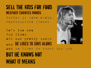


No comments:
Post a Comment