Wednesday, October 23, 2013
Unity Typography
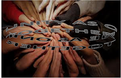
For the typography assignment I decided to use this picture. I picked the picture before I picked what I was going to do with text, but looking at how the hands all came together in a continuing circle gave me the idea for how I wanted the text to reflect the feeling. The text says "Unity as one as one together." I changed the shading on a few of the letters as well as the angle. I also turned the text into a continuous loop (which is why I needed to add another "together."). The effect I feel really reflects the point of this picture. The shading of the letters reflects the shades of skin. You can't really tell where the text begins and where it ends, because there is neither a beginning or an end. There are a lot of racial distinctions are stereotypes that often times form barriers between people. As this image and the typography I used with my text, it shows that though there may be a difference of color, that's as far as the difference goes. There's no need for any distinctions or separations.
Subscribe to:
Post Comments (Atom)

I like the radial movement that is reflected in both the type and the image.
ReplyDelete