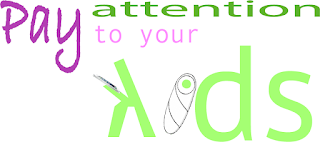
I have noticed lately that people just don't pay attention to their kids. Whether it's in a mall, in a restaurant, or on the street, parents pay more attention to their phones than their children. To convey that, I decided to make the "i" into a swaddled baby and the "k" into a distracted adult on an iPhone. I made sure the k was turned away to better illustrate this. For the color scheme, I chose a set based on complimentary colors. I wanted the message to be bright and fun, so I went with a green/purple set.

No comments:
Post a Comment