
Wednesday, March 28, 2018

Rene Sofia assignment (sensitivity, critical judgement, creative imagination)


My second is for Andre Mason's Masacre a la Crucifixion.
Tuesday, March 27, 2018
Semiotics 1
The signifier is a metal statue of a bull getting ready to charge.
I think that this signifies determination, driven attitudes, and a willingness to charge towards any and all problems head-on.
The reason why I think it signifies this is because it is placed in the most important business sector in the US. The US's economic system thrives and survives off of competition, I think that the bull embodies this by showing the fearless and headstrong attitude of the businessmen who pass it by within the statue.
I think that the meaning of the statue can change. Times that the economy is not good the bull signifies a willingness to persevere. The bull's position remains unchanged, it is ready and prepared to lunge forward to meet any challenge that arises.
Sunday, March 25, 2018
sketch--week 8

Saturday, March 24, 2018

Sunday, March 18, 2018
sketch---week 7

Weekly Sketch #8
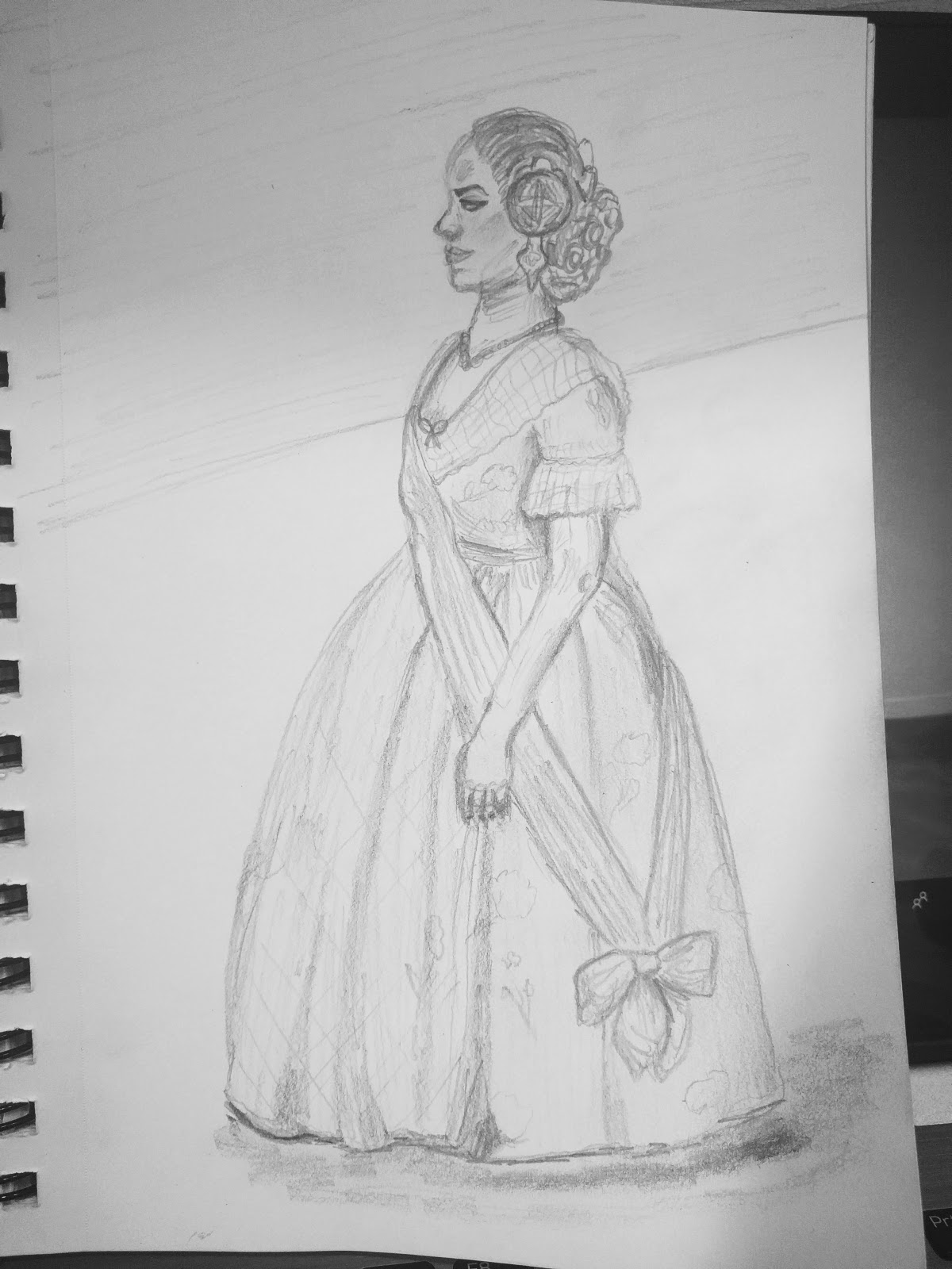
Let me just begin by saying that I want one of these dresses. If anyone finds out where I can get one, please let me know. :) Secondly, wow, what a day we had in Valencia! It was one whirlwind of an experience and I loved every minute of it. What an amazing opportunity to participate and witness such a unique and important cultural event here in Spain.
Weekly Sketch #8

I almost walked past this bakery in Madrid, but the neon lights pulled me in (side-note: it's difficult to show neon lights with a black pen). The shop owner asked if it was my first time visiting her store, and we had a short conversation about the types of bread to buy. It was the perfect experience for what was most likely my last time to go into Madrid.
Friday, March 16, 2018


Thursday, March 15, 2018

Wednesday, March 14, 2018
Weekly Sketch #7

It's strange to have only a few weeks left because I feel like everything went so quickly, but I am also grateful for these last few weeks to really enjoy the time we have left. The lighting around this couple was lovely, since it was dark and raining. There is something perfect about a quick walk around the town in the rain.
Tuesday, March 13, 2018
Weekly Sketch #7

As much as I love seeing the large buildings and iconic sights here in Spain, I am just as enchanted by the common, prosaic sights and details of Spanish daily life. Here in Spain, even a walk to work or a trip to the market has a certain sense of beauty and charm. For example, this weekend we went to a market in Madrid and these boxes of bread caught my attention. Although there is nothing inherently exciting about buying bread, I was delighted by this little stall with its wooden crates and fresh, floured loaves. It was just so unlike what I am used to seeing in the United States, and I loved it.
Monday, March 12, 2018


Sketch 6

Saturday, March 10, 2018
sketch 3/10

Friday, March 9, 2018

Sketch #6--with color


Weekly Sketch #6 + Animate with Color
I am now bordering on obsession, but I can't get over the walls at the Thyssen. The coral color has been one of my favorites for forever, and I have never seen a museum that didn't have neutral walls. It was overwhelming to walk through that museum, but I loved it. This painting in particular stood out to me. It was large--well over 8 feet--and it was simple. It was of a woman in a green dress. She is beautiful and elegant. You feel like she is living the best version of herself, and I am obsessed with the contrasting green and coral. She was hanging in between two large windows, and the symmetry added to the overall lovely affect. While I was at the Thyssen, I bought a few postcards, and the red paper is left over from the bag they gave me. The green paper is leftover from more postcards purchased at the Prado. The black paper is torn from a pamphlet from the 'Crucifixion' exhibit at Escorial.


Thursday, March 8, 2018
Weekly Sketch #6 + Color

Earlier this week I visited the Crystal Palace in Madrid. It was a building made almost entirely out of glass and it was situated in the center of Buen Retiro Park. As I stood inside, I was struck by how the glass walls reflected the sunlight and transformed my view of the park outside into a sparkling, mirage-like landscape. Although the building itself had no pigment or color, the transparent glass enhanced and changed the colors of the park beyond the walls. This sketch is my interpretation of gazing out at the park from within the glass walls of the Palace. The glass ceiling of the Palace peaked in a way that reminded me of a glass prism used to refract light, which is why I chose a rainbow color pattern for my sketch. I also kept the rest of the sketch neutral (black, white, and gray) so it would enhance the other colors and not distract from them. I avoided any dark shades of blue, purples, etc. because I wanted the walls and ceiling to maintain a sense of light and transparency rather than opaqueness or darkness.
Tuesday, March 6, 2018

Monday, March 5, 2018


Sunday, March 4, 2018

Saturday, March 3, 2018
Sketch---Week 5

Visual cue - The Great Gatsby

The eyes are a big symbol in this movie also an important visual cue because to me it represents hollowness of this "American Dream" that everyone is thriving to have. Everyone fends for themselves and maybe one or two succeed in wealth and this dream while doing so. In reality, The American Dream is just a dream to most people not everyone can live it.

Friday, March 2, 2018

Wednesday, February 28, 2018
Weekly Sketch #5
I have seen Degas ballerinas in museums all around the world, but today, I was moved to tears when I saw 'Bailarina basculando' (Bailarina verde). I'm not sure why it struck me today, but it's beautiful. The Thyssen is a beautiful museum in general--the coral walls are unique to most art museums and the color highlighted so many shades I loved in the paintings. I don't flatter myself by thinking I am great at drawing people, but I wanted to do a sketch about this painting because I think it's important to remember moments that move you.


Visual Cue- 500 Days of Summer

Just by looking at this screenshot you can tell this guy looks pretty miserable without knowing much behind the storyline. By observing this scene, you can see that he is in an elevator with an i-hate-the-world expression on his face, along with an un-kept appearance, and a slouched body posture. This leads to the conclusion that he must be unhappy and or depressed. In previous scenes, it shows a much more put together persona of him, being dressed nicely with his hair combed and an optimistic/positive look on his face. It shows him being productive at work, but later (in relation to this scene shown) it shows him with no inspiration or output at work. All of these sharp contrasting visual cues are due to either the presence or lack of being in love. It is not hard to notice when Tom is in love during a scene or when he has had his heart ripped out by whom he thinks is his “soulmate” because of the visual cues given.
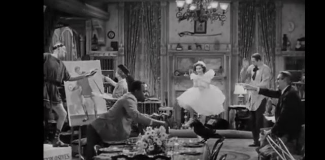
Visual Cue
This is a screenshot from the movie “You Can’t Take It With You.” I chose this scene because when I was little I would watch this and would instantly want to just jump right into it. The visual cue here is all the chaos and excitement going on. You can see the one sister is in her ballet costume, the mother is painting, the uncle is in his costume posing, the grandfather is watching in amusement, their house keepers boyfriend is setting the table, and the dance teacher/friend is clapping along with the music. From their stances and expression in their faces you can see the joy they have, and just how much fun they are having. 


Tuesday, February 27, 2018
Visual Cue
 Inception is my all time favorite movie, and it incorporates a lot of originally Spanish ideas interestingly; the dream with in a dream, or is reality just a dream, is not original which you probably already knew. Anyway, to identify the most striking visual cue, I muted the sound and started the movie. Here, Cob looks up from his grits or oatmeal after Sito drops reminders of their "memories" as young men. Cob is now realizing/ remembering what he came to do, and he looks up. The lighting of the room, the shadow and highlight of his face, his dialated pupils, facial expresion, are all brought out by this camera angle, up close and right in front of Cob, practically on the table. The whole cut is better than this one image, and it makes the viewer intrigued. Something important and deep and amazing is happening here, I mean look at this guy's face. What a great intro.
Weekly Sketch #5

In the evenings, the Plaza de Cervantes is usually teaming with people -- children playing tag, old men smoking and arguing, mothers pushing strollers, and couples holding hands. Almost every Sunday evening, this magician comes to the Plaza to put on a show for the people of Alcala. He is incredibly charismatic and always has the audience laughing at and participating in his performance. I love seeing people from all walks of life come together as a community to enjoy a show.
Visual Cue--The Grand Budapest Hotel


In the
Grand Budapest Hotel, the scenes with the main characters Zero and Gustav,
Gustav was always filmed larger and more central than Zero to show his
dominance but then after Zero saves him they are filmed on the same plane as
equals. This is just one of the many ways the director Wes Anderson used the
way of filming and his composition to share a message. His message here was
that before Zero was nothing but a lobby boy, but after he showed his strength
he was more than that to Gustav.
Subscribe to:
Posts (Atom)