Saturday, May 31, 2014

Composition

Radial Symetry - I took this picture looking up at the top of the glass structure of the libary.  The center serves as the focus point and creates consisten shapes spanning outwards.  
Asymmetrical Balance - When framing this shot, I tried to position the two rocks so that they were evenly spaced in the frame.  This gives each side equal visual weight and interest.  

Bilateral Symmetry - I loved this shot because it brought together the natural symmetry of the statue plus the symmetry that exists in the scaffolding behind.  

Wednesday, May 28, 2014

In Case of Fire

For whatever reason, my typography "Call to Action" didn't upload properly. Here it is again.
I wanted to do something that had an everyday, common warning mixed with the action it was implying, like an onomatopoeia with font. The lead-up font would be calm, with only a slight description attached to the word "fire." The follow-up would be more dramatic, more exciting and show something more akin to the action itself.

Telling Type

I had a lot of difficulty with the software, and don't have a computer version of my type project anymore, but here are the original sketches. (All the european type guys were handwriting stuff, so this is okay, right?) My call to actions were to exercise and to do yoga. Stick figure letters isn't that original, but I thought they were cool anyway.

Tuesday, May 27, 2014

Eat Healthy


Here is an attempt to use a font to symbolize the fact that "eating healthy" is expensive. I tried to find a font that was fancy and seemed to symbolize wealth. Then, I added a few of my own touches (the lady and the wine glass) to make the meaning even more strong. I kept the olive yellow so that it would also resemble a coin. I tried to use rich, strong colors because I felt they would give the picture a "rich" feel.

Typography


For my typography I chose to do an ad for Starbucks Coffee. I thought it would be good to use a more wavy font to go in the coffee to look like cream in the coffee. The ad is supposed to say that a coffee starts a morning off right. 

Seize the day


I decided to use one of my favorite quotes for this assignment. I wanted to use a broad/wide font to emphasize the word "seize" to make the viewer aware of the importance of this one word. I used a thinner looking font with "the day" to make it clear and visual appealing for the viewer. Lastly, I used this picture to tie in the quote and the fonts. I wanted to make the font for the first word heavy to grab the viewer's attention and the underlining as well.

Date More Women


I took on the slogan "Date More Women" encouraging men to take women on dates.  I wanted to find two fonts the represented the two main concepts in the phrase.  For date I wanted a font that seemed more permanent and reminiscent of font that might be used on a calender.  For the word women, I wanted to use a font that was feminine and graceful.  I found inspiration from the Diet Coke can design.  To me, this fonts seem to suggest elegance and modern taste.  I separated the "W" further from the rest of the word because I wanted to emphasis the focus on women.  

I decided to use extra "weight" within the word itself.  The call to action here is to help people recognize how much weight is between them and being fit.  Ive created a heavier font, and made it bigger and bolder.  It stands out the most.  The play on words is the line itself, asking if one is overweight or the over the idea of being overweight.  Get it?

Wednesday, May 21, 2014

Gestalt


Turns out my assignment was still in drafts!

Two Elements: Similarity and Proximity

For this assignment, I decided to use circles and place them close together to form my initals "K" and "G". The similarity comes from using circles throughout the piece. Proximity comes from the closeness of the circles to forms each letter.

Gestalt and Color - Sam Bennion


This first one is my attempt at a Gestalt design. It's got continuation and closure elements, but very little color--that's intentional. It's supposed to lead the eye up the image and is deliberately vague.

This second image is a logo I'm working on for a club I recently got approved by BYU Clubs and Orgs--it's a soccer club called "Royal Blue." I wanted the image to invoke both modernism and tradition, with colors that are true to the name (Royal Blue), true to BYU colors, but bright and complementary enough to get by. I think it turned out okay, but it still needs some tweaking.

Gestalt Theory


I decided to try and do a picture using the Gestalt theories of similarity and proximity. It uses similarity because all of the dots are about the same size and color. The proximity comes in because the dots come together to form an image (The image is the bat signal (in case you didn't know(like the one that hangs over the mean streets of Gotham when the town is in need of a vigilante hero))). 

Tuesday, May 20, 2014

Gestalt Theory


In my design I used the Gestalt principles of similarity with the repeating lines. Repeating both the thick and the thin lines through the design. Proximity is always shown with how the lines are spaced, and with the read on the far right side, I feel like it draws the eye and leads it to the right of the design which could be a form of continuation. Of course the read is supposed to be part of a play on words idea like "read between the lines" sort of situation.

Color Theory

I uploaded a picture I found through one of my favorite photographers that had mostly green and grey based colors. I really liked the tones because they were calming and not too bright. The two different greenish colors in the design are from the same hue only one is a tint, because white was added to make it lighter and the other is a shade which is darker by adding black to it. The other color is grey which is just even lighter than the light green, and the tan color is completely different than everything else and is   most likely a tint of orange.


BEATS Color Scheme

Gestalt the Elephant

Because this is a no-judgment zone, I'm going to share Gestalt the Elephant with you all.

He uses many gestalt principles, because he is very good at remembering them.
First, he uses similarity because all the blocks are *about* the same size, and similar in color...kind of.
Second, he uses proximity by having all these shapes, though not touching, close to each other showing that they belong together and make a larger picture than they could by themselves.
Third, he uses closure, because you have to fill in the blanks to see the top of his head or his trunk.

He is also part of my color experiment. I used many different hues of the color yellow. By adding different levels of grey (getting tones), black (getting shades), and white (getting tints), I ended up with nine different colors that go well together.

Gestalt Theory

This is a logo design that I made. My friend is starting a company that has a product that cleans leather. I wanted to give it a try to make a logo for this company. I am hoping you can notice the water droplet in the bull. This logo contains both figure/ground and closure. I wanted it to have the feel that this cleaning product can make a dent in any leather. 

Color Theory Assignment: Signature


I wasn't sure what I would design for my color assignment so I thought I would just sign my name. I used these colors because I wanted to start with a blue color that could resemble an elephant because my signature is in the shape of an elephant. With that, I used colors that worked with the main blue that I picked. I thought the touch of yellow was a nice contrast. 

LEGO AND FINISH LINE


I'm sure you can't tell but this was one of the first times I've ever had to use some type of computer program to design an image.  In the first, I use closure as you literally have to piece together the lego pieces.  I also used proximity as the pieces were grouped together to make the whole and similarity to create the individual letters.  The letters I thought were a great example of the "whole" being made up of individual parts, literally.

This one is just funny, it mostly plays on one's ability to sense closure out of the image.  There is also proximity.


I took this color scheme from the adobe tool we used.  It's probably one of my favorites.  I love the blue and gray.


Gestalt Theory 1

I designed the logo above by trying to use some of the Gestalt design principles we learned in class.  Pop'n Sweets is a local company that sells soda and candy from around the world.  I used the closure and proximity traits to create a soda bottle from single lines.  I also tried to put the font in such a proximity that unified the text to the picture to produce a unified whole.  I would hope that this design gives the logo a clean and modern feel.

Color Theory 1

Above is my try at coming up with a good color palette.  I used Kuler to come up with four different shades of blue to use in a logo design.  I wanted to choose a hue that was relaxing and promoted confidence.  The shade is different because of a higher white balance, which causes the base color to become lighter.  I used the different color shades to give the illusion of coins sitting in the palm of a hand.

Monday, May 19, 2014

Semiotics #1 and #2

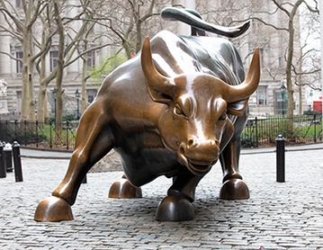
To me, the Wall Street Bull signifies several things. First and foremost, it seems like a symbol of male dominance. This is a strong, virile, masculine symbol. There isn't a soft-eyed statue of a doe next to it. This is a stud, a male specimen designed to be the largest, biggest, and best of its kind, and to spread its seed near and far.

A bull this size has one of four purposes: it's either destined for the slaughterhouse, it can be a stud, or it can be in rodeos. Wall Street isn't a rodeo and it isn't a slaughterhouse. These investors want an icon of invincibility. They want to feel like their financial seed will be perpetuated, yielding a cash cow.

Such a male specimen also has implications towards the male chauvinism of the financial world. To me, the Wall Street Bull is a statement that the world of money, investments, and stocks is one that was founded by and belongs to men.

Semiotics #2


When the Olympics and Paralympics were in Salt Lake City, I attended an ice sledge hockey event. It was for men who were either paralyzed from the waist down or who were amputees in one or both of their legs. Their upper body strength and athleticism was amazing to watch.

This picture reflects that. This picture has a lot of implications, just by its nature. Normal track events don't require helmets, so these men must be travelling at incredible speeds at great personal risk. Similarly, you can see the commitment, the intensity, and the strength of these men. Two of those pictured have distinct tattoos. The leader's reads "Mason," who I assume is a son or other close family member. One could surmise that the athletes are not only representing their country, but also proving something to themselves and their families.

One final observation: the stands in the background are blurred, but appear to be packed. These events are not typically as well-attended as regular track-style events. Thus, I'd say that this must be a championship event and that these athletes are representing their country and doing it well.

It's a powerful image of power, passion, intensity, perseverance, strength, and human spirit. Honestly, though, it only means these things to me because I like it. Perhaps that's something that could be said of Semiotics--our likes and dislikes will inherently affect our interpretation of a work.

Semiotics - Jonny Harline


This is one of my favorite pictures I have ever seen. It brings back so many memories of good times in BYU football, which have been few and far between in the nearly eight years since. However, in the hundreds of times I've seen this photo, I had never really analyzed the semiotics of it until now.

Even if I had no knowledge of the background of this picture, it's easy to see that Harline and his teammates are celebrating a touchdown at the very least. You can see five white-clad players in various stages of celebration - two with arms raised, two taking off their helmets and falling to the ground, and one seemingly jumping up and down. I think it's interesting that the main subject of the photo has his back to us, although with his helmet on it would be difficult to see any facial expression even if he turned around. There is only one opposing player in the picture, which makes me think, who was supposed to be covering Harline? I also love that the photographer took the picture from an angle that would show Utah's sideline rather than BYU's. While this photo is not political or racial or of any real importance to the world, it's still loaded with semiotics....and very important to me.

Semiotics - Charging Bull

When I first saw this photo, having never heard of or seen it before, I immediately thought of Chicago for two reasons. First, I thought it might be a statue outside United Center where the Chicago Bulls play. I had also heard a little about CowParade - a public art event which originated in Chicago where people paint sculptures of cows around the city - so I thought it might have been leftover from that event. Obviously, after learning that the bull is actually on Wall Street, I began to have very different ideas about what it might signify.

First of all, I was struck by the size of the sculpture. In comparison to the cars and people in the pictures, that bull is massive! Secondly, I was drawn to the active position of the bull. It's clearly caught in a state of motion, hunched down, head lowered, ready to charge with its powerful hind legs. This shows us that Wall Street is always ready to move and trample anyone or anything that stands in its way. Finally, I tried to think of another animal that better represents brute strength and aggression, but I couldn't come up with anything that embodies those two qualities as well as a bull. I imagine those who make a living on Wall Street are proud to have this huge, strong, powerful beast for a mascot.

Sunday, May 18, 2014

Semiotics #1

The bull on Wall Street. This Bronze Bull is put in this certain place for a particular reason. The Bull is strong and powerful and ready to charge. The bull represents how those in the financial district should behave, they should be aggressive and powerful in how they act to get ahead in their world.
The bull has a different meaning to those from outside the financial district in New York. I was first shown this image in church where my teacher told us that people still worship golden calves (like the one that Moses smashed when he came down from Mt Sinai with the ten commandments). The image of putting money, greed and ego above God and family is what this image signified to my Sunday school teacher.

Trevor's Semiotics picture

This is a very famous image of a Buddhist monk lighting himself on fire to protest the behavior of the South Vietnamese government towards Buddhist. The thing that strikes me in this image is the yin and yang that is happening, there is peace and chaos happening at the same time in this picture. The extreme image calls for extreme change to take place. It calls for attention and action. It is very emotional and represents how a peaceful people are being wronged.

Semiotics 2


This image was taken by my favorite photographer, Ryan Muirhead a few years ago. I have never read about what his intentions were for this image but I feel like it signifies a lot. To me, The girl is looking at a magazine while standing under running water which could signify anxiety. It's not the same sensation as drowning as you would feel in a tub, but just a constant feeling of anxiety while looking through images in a magazine. Whether that anxiety is felt from the pressure to live up to the images shown in the magazine or from outside sources, either way there is a sense of uneasiness to her expression.  The fact that this photograph is in black and white also brings a little more emotion to it, making things seem like life is black and white, but this photo is proving that idea wrong at the same time. She's a beautiful girl in a state of constant drowning or anxiety while looking through a magazine, to me it's a reflection of society and the stress it puts on our girls. 

Semiotics 2


This picture to me shows how important an instrument can be in someone's life. Somebody created that instrument and something as simple as rain can ruin it. This picture makes the instrument look like a real person. It is cool to think about how much this one instrument can change lives. Music can help bring the Spirit. Music can make someone happy. Music can also make someone sad or even scared. This man is protecting this instrument so that it can continue to change lives. The painter in the background isn't even covering his painting. It shows who cares more for their work of art. I feel like there is a lot of different meaning behind this one picture.


Semiotics 2
This image was taken in North Korea recently.  It is taken from a place called delphinium in Pyongyang, North Korea.  The picture is a crowd of people watching aquatic animals perform an entertainment show.  When I analyzed this picture some very interesting insights came to mind.  First of all, one of the rules at the park states that you can only take pictures of the animals and not other people.  Why is that?  Possible one of the reasons is that 95% of this audience is military personnel.  They make up a large part of the people that have access and financial means to attend such a place.  We can assume because of the extreme poverty in the country, that the rest of the people attending are either well off or politically connected.  The presence of the military suggests what is important to the North Korean government.  They seek control by physical force.  Everything, even such an event as this, is controlled and operated under the state.  

You will also notice that no women are present from the military.  Only men are allowed to participate in military arenas.  Each individual is told where to sit and what appropriate conduct is for the situation according to the state.  To me this picture speaks volumes about the role and position of government in North Korea.  

Semiotics 1


The signifier is a bronze charging bull. This signifies financial prosperity. This charging bull is placed in Bowling Green Park near Wall Street in New York City. It is there to be a symbol for all to see how powerful money can be. Though this bull is charging and is full of energy, it can also make a big mistake and run into trouble. This can be a way to show how the stock market is unpredictable. 

I feel that this sculpture has a little bit of evilness to it. It seems to represent how people care more about power and finances than helping the poor and needy. It acts as a god or idol that many worship these days. 

Semiotics 1

The signifier is the bronze bull in New York City.

The bull signifies the aggressive nature of Wall Street. Whether that may be positive or negative could depend on the economic state at the time, but the bull itself is extremely aggressive in its stance and by its size.

Working on Wall Street is stressful no matter what time of year it is, and no matter what struggles or lack of struggles the economy could be facing, the bull symbolizes the tough nature of the job, the price that is paid with working there, the nature of the beast you could say.

It's tough and strong yet also lacks control,  like our stock market, which can fluctuate for any number of reasons. When working on Wall street the potential to earn good money is there, but the risk involved in investing, etc., lacks a certain amount of control.

DUNAMIS


This is a picture I took in London of one of my favorite statues there. The signifier, or physical elements are a man holding a statue. It’s called Dunamis: Achieving the impossible by Bushra Fakhoury. Yes, the meaning behind this statue seems pretty obvious—people can do impossible things—but I took my own interpretation one step further. To me, this man does not seem like the usual “everyday” guy that gets used to tell people they are more than they are in ads. Usually we have a wholesome, strong, and healthy type. Or maybe even the hipster, or the bad boy etc. Advertisements and statement pieces usually use someone sexy or fashionable or traditional to relate to. With this statue, that isn’t the case. He’s old and wiry. He’s bearded and wearing a weird hat. He’s not fully clothed. To me this statue says you have to be true to your true and corky self in order to achieve the impossible.

The Bull

The signifier: a larger than life, aggressive bronze located in the financial district.
What is signifies: the aggressive (and potentially destructive) attitude in the financial arena.


I think that’s the “correct” answer, but I had to do some research to find it. My own interpretation was a little different. I saw all the same signifiers, but without realizing the statue was in the financial district. All I knew was it was in a city. To me, this seemed like an artist’s statement that people don’t do well stuck in concrete landscapes (bronze casting), but that we instead need room and freedom to thrive.

Semiotics 2


For this assignment, I wanted to research the meaning behind the Starbucks logo. I have never really paid attention to the green logo until this weekend. At first glance, all I see is a mermaid cartoon with the brand name--Starbucks Coffee. After doing some research on this company, I have come to the following conclusion. The mermaid looking cartoon is actually a siren--which is a sea creature symbolizes desire. I feel like this is a perfect symbol for the Starbucks company because in a way many individuals are drawn to coffee and need coffee in their morning routine. I believe that this siren connate the fact that coffee is desirable to all individuals who consume their products on a daily basis.

Saturday, May 17, 2014

SEMIOTICS 1

The signifier is a large bronze sculpture of a bull in a "ready to charge" position. This large sculpture is located in Bowling Green Park near Wall Street in New York City. The bull sculpture represents determination, aggressiveness and strength when it comes to the financial aspect. Wall Street is the domain of the New York Exchange--which is the largest stock exchange. In the business sector, the bull represents a fierce will to conquer any challenge. Like the financial crisis in 2008, the bull is a reminder that you need to be strong and powerful to survive. Most importantly, success is the reward for enduring the good and bad challenges that will certainly come your way.


Semiotics 1

It's my opinion that this symbol changes meanings over time and within different political groupings of people.  The Charging Bull sits close to Wall Street in New York City.  The posture of the bull seems to signify the pride and haughtiness of Wall Street.  The bull is full of life and is aggressive in its facial expression and stance.  This seems to reflect the competitive nature of Wall Street, New York, and The United States.  

I think this symbol was seen quite positively before the 2008 financial crisis but due to the political and economical upheaval this country felt during that time, I believe that many would see this statue as a symbol of everything that is wrong with Wall Street today.  Many people today would say this statue is symbolic of the greed, ignorance, and total recklessness with other peoples money that was displayed during the financial crisis.  Some groups might even say that this bull represents the nature of The United States government, clumsy and stomping over everything and everyone else in the world.  The Occupy Wall Street Movement famously used this bull with a ballerina twirling on its head to communicate to the world that Wall Street was reckless and too greedy.  

Yet others might say this is a symbol of everything right with America.  Its strong, taking on the challenges without hesitation.  It never seeks aggression but rather always defends those most important to it and the ideals it cherishes.  It sheer size and casting in metal speak volumes.  It demonstrates the wealth and power this area holds.  It is meant to be seen.  When the stock market seems to be on the rise, people often refer to it as a "bull market" meaning that people are confident that the market will gain.  This phrase seems to directly correlate with the symbolic meaning of this statue.  

Pepsi-Yang

I've never had a hobby of looking into things for deeper meaning or symbolism.  I've really enjoyed trying to understand symbols and images and pictures more, even those things that we observe in our everyday life.  I searched logos in Google to try and find a logo that I never realized had a deeper semiotic meaning and connotation.  That's when I found the Pepsi logo.  It looks a lot like a Yin-Yang.  There is the diagonal squiggly line separating the two colors.  I don't think this was on accident.  They were probably trying to connote perfection and harmony in their ingredients and/or taste.  I don't think the color picking was on accident either.  I never noticed they were red white and blue, sound familiar?  Connoting a patriotic drink, a drink for the American people, their main public obviously when the logo was created.  Even the font gives off a a certain connotation of professional but relaxed.

The Bull of Wall Street.

         This is an awesome image that has a lot more to it than meets the eye.  The signifier is simply a bronze sculptor of a bull.  However, it's location as to where it's placed an how, it's physical features etc. signify so much more than just an ordinary farm animal.  The famous sculpture is located in the financial sector in New York in the direct vicinity of Wall Street.  The bull was not built on the site on accident.  It represents the aggressive and successful  attitude of the financial arena on wall street.  The bull is positioned to charge or attack.  Its face is one of aggression and violence.  This represents Wall Street exactly; a cut throat environment, where aggression is necessary to succeed.  it represents that there are victors and losers, and your size, strength, motivation, and aggression all matter to success.

Monday, May 12, 2014

Single Story - Atheism

Last week, the president of American Atheists announced plans for an atheist TV channel. Beyond that fact, it seems that all news outlets disagree and argue about what this might mean.

It's hard to collect the "Single Story" on atheists. Even the delivery of this news about the atheist TV channel, a straightforward reporting job, was spun and twisted, paraded and trumpeted, protested and renounced. While the USA Today reported the news with Christianity as a comparison and a backdrop, ("Move over, Christian televangelists. Atheism is coming to television."), the Christian Post was sure to include references to socially questionable actions of atheists in years past, such as their protest of the cross-shaped beam at the 9/11 Memorial.

From the composite of all the sources, I'd say that atheists are just like the rest of us. The difference is more publicity. Because atheism is so outspokenly non-secular, non-secular news outlets are able to give them favorable news coverage. By the same token, more secular news outlets can give them extremely unfavorable news coverage.

As a result, I think that there is a disconnect growing in America. Atheists and agnostics will look at the actions of their unbelieving allies and think of them as civil rights leaders. Those who oppose atheism must be religious zealots and bigots. After all, when stories like "Embrace of Atheism Put an Indonesian in Prison" are emblazoned across the front page of the New York Times, it's be easy to see atheism as an equal rights issue. On the other hand, with stories like "Atheist Group Resurrects War on Easter" and "A Christmas Gift for Atheists -- Five Reasons Why God Exists" are distributed courtesy of Fox News, theists and religious folk will feel that they are under attack.

I suppose that the single story from all these sources would be that atheists are people with a belief system. That's it. Their problem is that they are a catalyst for heated political discourse and dramatic headlines. They make religious folk seem like extremists and the non-religious seem like anarchists. They make people spring to the aid of their First Amendment rights, both in defense of and attack on God. I hope that as people read from a variety of news sources, they can see that these people are just people and that the "single story" here has been milked by both sides of the political media.

http://www.usatoday.com/story/news/nation-now/2014/05/09/atheist-television-channel/8891455/
http://www.nytimes.com/2014/05/04/world/asia/indonesian-who-embraced-atheism-landed-in-prison.html?_r=0
http://www.washingtonpost.com/national/religion/new-openly-secular-group-seeks-to-combat-anti-atheist-discrimination/2014/05/02/b8195ba8-d231-11e3-a714-be7e7f142085_story.html
http://www.christianpost.com/news/american-atheists-launching-worlds-first-all-atheist-tv-channel-119451/
http://www.foxnews.com/opinion/2013/12/13/christmas-gift-for-atheists-five-reasons-why-god-exists/

Single Mommy Bloggin' Story

Group: mommy bloggers

The story:
These ladies are Midwest housewives with multiple kids. They are Christian and have at least graduated high school. Many have graduated college, but many have also dropped out of college for the kids. They are involved women and devoted mothers who write insightfully about their opinions, but are judgmental of opinions and others who differ from them. They have a basic knowledge on a wide range of topics such as parenting, make-up, cooking, crafting etc. They are notoriously envious of other people’s lives, and like looking better off despite "all the things" they have to do, even if they are not. They are a powerful group of 4.4 million women, with 18.3 followers.
These messages are demonstrated by titles of books like “the mommy mob” and in the comments of more controversial parenting opinions. Also the fact that mommy bloggers are writing about how judgmental other mommy bloggers are…hmm….

I also found many of the articles that were about women fighting the single story. Some are offended that the label “Mommy blogger” is used so widely. Women who write about politics in Washington, but might have the occasional mention of a child will get lumped in with any legitimately bat-crazy "mommy." It's the Victorian woman novelist all over again. Women writers get treated differently (i. e. like second class writers). But things may be changing. One woman said, “If we as women and mothers buy into this idea that mommy blogging is shrill and a negative label — then how can we expect anyone else to take us seriously?” (Huffington article). The fact that so many articles were written to contradict the single story is proof of the possibility of change.