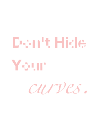
My call to action is to all the curvy women out there. Stop trying to hide your curves, but embrace them. I wanted to display this in the call to action through its typography. I chose a light pink, a more feminine color, with a simple white background, to prove that my audience was directed to women. I wanted it to be a "soft look" as curvy women tend to be more soft ;) I "hid/erased" the curves in the first three words giving it the Gestalt "closure" effect. My motive behind this was to show that although the words are legible, they aren't as beautiful as the last word without their connecting curves. The last word, "curves," I wanted to be fully embracing the curvy letters to show it's beauty in it's truest form.
No comments:
Post a Comment