Friday, March 25, 2016
Typography
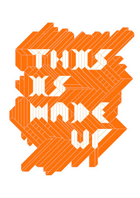
I came across this while browsing different varieties of typography on the Internet, and it immediately stood out to me. I thought it was interesting how my mind was instantly able to interpret the text, even though some of these letters definitely don't resemble what we normally see. In looking at it closer, I realized that each letter appears to be made up of small shapes, mainly trapezoids, parallelograms, rectangles and triangles. However, it is possible that the lines were simply meant to add texture to the picture and were put in after the fact. Whatever the case, this is some very unique typography that has a message that very well might relate to its composition.
Subscribe to:
Post Comments (Atom)

I like this design a lot, partially because it really is a work of art at the same time. The positioning of the background and the letters works well, and creates a strangely haphazard effect while still having it be very orderly since it's all made of those tiny, thin shapes.
ReplyDelete