Ad 1: Just Don’t Do It
For this piece, one of the main things I was trying to accomplish was to spoof the Nike slogan, “just do it” and thereby capture readers with this play on a well-known slogan. I chose darker blue for the Nike swoosh so that it would stand out against the background. I also rotated the swoosh and cut off the ends to make it a cross to turn the swoosh into an “x,” reinforcing the idea of not doing something. The cross being the same color as the swoosh successfully completes the conversion to an “x.” The x also interrupts the flow of the swoosh, but the viewer can still complete the image. I also selected a bold style of font, tightened the tracking, and kerned the text to achieve a font similar to what is used on the Nike advertisements, only adding to my intentional spoof of the Nike campaign.
Ad 2: Go Procrastinate
For this ad, I wanted to trick the reader into thinking they were looking at one kind of advertisement and then lead them into another. I started in the top left third of the Ad with a Go Pro camera. The reader’s eyes will naturally be drawn down the camera to the white letters “Go Pro” which is finished off with “-crastinate” and a clever line beneath it. I also placed a photo of a friend sleeping (the photo also implements the rule of thirds) onto the screen of the camera and the color of his clothing matches the color scheme of my advertisements (various blues and tan/brown). Lastly, while the ad may feel a little top heavy with the big camera, I feel the hashtag in the opposite, bottom right corner balances it out.
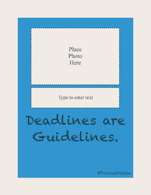
Ad 3: Deadlines are Guidelines
In this ad, I went for a very basic but unique approach to express procrastination: not completing the ad. I intentionally selected wording and font that appears regularly in Microsoft Office software (which I expect students to be familiar with) as well as using a font that is far from professional to express the fact that procrastinating is somehow different and breaking from the mold. Even though the lines for the boxes are dotted, the viewer can easily fill it in and realize that they are boxes meant for an image or text. Lastly, the use of a dark blue for my punch line quickly draws the viewer away from the plain white boxes and towards the most colorful part of the page. Again, I used the rule of thirds to place that text at the bottom third of the advertisement.
Overall Goals
In my campaign, I wanted to provide college students with some comic relief at a time of great stress during finals. Of course, nobody is going to just not do anything. And I don’t necessarily want them to do that (as I hope my humor illustrates). But, playing off of that thought is sure to bring a few smiles. I made sure to use a color scheme of cool colors (blue seemed very appropriate since we attend BYU) because my face-value message is to have the consumer be lazy and procrastinate (and at the very least I just want them to calm down a little bit instead of get amped up, which hot colors might encourage). I also selected various fonts and used the Go Pro and Nike ideas (which should be understood almost universally by college students) to appeal to that younger crowd of studying students as opposed to teachers or older adults. Too bad you probably aren’t reading this until everyone else’s finals are over…but maybe you can use them next semester?


No comments:
Post a Comment